Here’s How We Built a Truly Personalised App Experience @MakeMyTrip
At MakeMyTrip, we constantly aspire to make travel research, planning and booking experience seamless for our users. Our design, product and engineering teams are committed to developing technologies which create an impactful experience for our users. One of the core components to make that experience seamless and immensely relevant is to show the right information to the user at the right time and in the right context. Most of you would agree that travel booking involves a lot of planning, be it leisure trip or business travel. Depending on where, with whom and under which context one is travelling, the user preferences and choice varies. At MakeMyTrip, we strive to solve for this by taking into account user preferences, search history and by leveraging our years of travel booking experience.
In a recent talk Google Product Leader Luke W spoke of how desktop-first companies fail to embrace mobile-centric thinking and cited eBay’s decade long struggle to design for mobile – or Amazon’s years of experiments in bettering its passwords entry flows until they realised that just fingerprint scan on a mobile could do just as well. Luke calls these pixel-pushing, performance-enhancing releases – merely incremental. Exactly that is what Cosmos (this project was internally code-named Cosmos) is not.
What we have released is significant because of the invisible elements that embrace mobile centricity: the power of location, the understanding of individual intent through navigation, search, shortlisting and more.
The idea is not to create for a billion users – but design specifically for one, create around one. Scalable to a billion, individually, in milli seconds. The idea is to play up the ‘my’ in MakeMyTrip.

Because mobile allows us to personalize your experience in a way that no other technology before ever did.
OTAs have close to 82% cart abandonment and APAC rates are amongst the highest. A MilwardBrown study cites 87% users willing to retrace, reconsider their searches and carts. Cosmos is a key step in retaining contexts, reducing friction and remarketing.
Its significant because deep personalization can lead to intelligent persuasion and social proofing. And eventually conversions!
What we realized over a period of time is that at our scale where we are serving millions of users every day, one size fits all approach is not best from user experience point of view. We started by thinking how we can make the user experience personalised, starting from the research/planning phase to the booking phase to post booking travel related use cases.
This is how we solved it!We started with a simple question – How to leverage user’s historical search data to personalise the product experience with the objective to show the right information to the user at the right time?
We are serving millions of app impressions across our user base every day, so we started our journey by personalising the homepage for our users. We segregated our users into different buckets so as to understand what we can do differently for different user cohorts and how we can build a more relevant product experience for our users. Our users were dissected into the following categories:
- When a user has not historically searched with us
- When a user has searched with us before
- Searched for a flight
- Searched for a hotel
- Searched for a holiday destination
- Searched for more than one i.e. flights and hotels both, hotels and holidays etc.
- When a user has searched and booked with us before and is coming back again
- When a user has an upcoming booking
- On the day of travel
- Once a user has completed a trip with us
In each of the above scenarios, we needed to serve a very different kind of information to the user. For e.g. if a user has not searched with us earlier, we need to present the user with the most relevant content which inspires the user to travel. If a user has already made a search, we need to identify the most relevant information which will aid a user in making a booking. When a user has made a booking, the most important post booking scenarios which a user needs to be made aware of need to be highlighted.
While designing the experience, we kept all of these scenarios in mind and came up with a card based layout so as to serve the most relevant cards depending upon current user state.
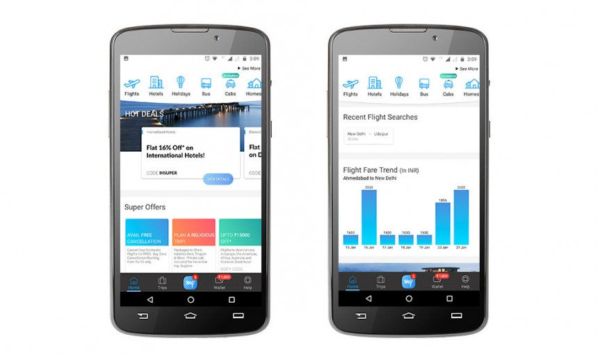
When a user has not made any search with us: Presenting them with best offers, trending destinations basis searches happening around his/her area, lowest flight fares from user’s geo location.
- When a user has searched for a flight before: Presenting them with recent flight searches and flight fare trend, so that a user can pick the best available fare around the search date.
- When a user has searched a hotel before: Presenting them with recommended hotels in the city basis user’s last search. We also take into account user’s booking and search history to create user preferences and accordingly serve the most optimal recommendations.
- When a user has searched for a holiday package, we recommend hand-picked packages to the user.
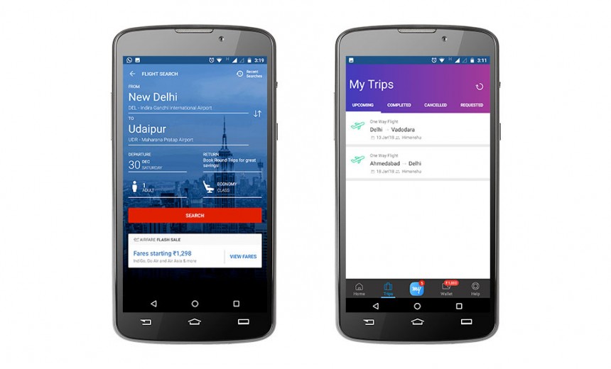
- When a user has an upcoming trip with us: We show the most relevant information/actions related to their booking, like-
- Get directions to the hotel
- Web-check-in for flights
- Call our hotline in case of any issues and we will help resolve it at the earliest
- Refund status in case of a pending refund

- At the backend, we have built a real time personalisation system which serves the response with 500 ms. It takes into account user’s search events and fetches the information accordingly from various downstream systems to serve the same to the user. It is absolutely real time as it is comes into effect as soon as you come back to the homepage after searching
- With Project Cosmos, we have introduced a concept of per user databases so as to store the required information at a user level.
- Tech Stack (Big Data : Spark/Scala)
- Glide: Real-time processing engine based on Spark streaming
- Processes search events in real-time from Hotels, Flights, Device details etc.
- Processes booking events from site databases in real-time from MySQL bin logs
- Processes a total of 1,50,000 events per day
- 99%ile latency of processing an event is 500 nanoseconds
- Boulder DB Database
- A new in-house developed database written on top of RocksDB
- Supports cluster coordination, nodes, database versioning management and multi datacenter support using Consul
- Embedded spark streaming (Glide) inside the DB to update data from Kafka
- Uses Akka HTTP as API serving layer
- Can serve upto 3,00,000 requests per second in each DC with 3 nodes with 99%ile latency of under 10ms
- Personalised information helps user in quicker decision making, resulting in improved conversion metrics for us. Yes, it drives more purchases indeed!
- Personalised cards generate a higher CTR than non-personalised ones. Down the funnel success metrics also have improved with personalisation doled out to the user
- Personalisation creates a two-way awareness. This is how it works: We get to know what information our users are keen to find and hence we are able to direct them to the right card or the screen. This increases their awareness of best offers, holiday possibilities, destinations, similar destinations, best dates to visit, events, and the like, in turn making them come back to our app. The more aware we are of things specific to their requirement and liking, the more likely they are to frequent our app.
- Personalised dissemination of information helps in building loyalty and retaining customers. When a user is always served offers and details relevant to them at a given point in time, they are bound to feel more connected and loyal towards the brand. This gives them the feeling that this is the brand that knows them and their requirements the best. This is when the brand is likely to become a habit for them.
- It is very important to define the goal of personalisation before starting on a journey of this kind.
- Goals could vary by different user scenarios: Our goal for a user who has not searched yet, would be to enable discovery of best travel destination for him or her, whereas for a user who is coming back to us after making a search, our goal would be to converge the search process for that user by showing him the most relevant options.
- Continuation of this journey into flights, hotels and holiday products as well so that a user is being shown the most relevant information on the whole.
- Auto sequencing of card basis performance of each of the card to give more impressions to the best performing cards and thus optimizing the performance.
- Social signals from users social graph to further personalise information for the user basis one’s social circle
We have recently been featured by Google on Play Store for being one of the best apps in the travel category.
We will continue to strive for gold standard to always be on top by adapting to latest technologies and consumer preferences. So how has your experience with our app been? We would love to hear your feedback on this.


